01
SaaS UX audit
A heuristic review of your product, plus analytics, session recordings and support tickets, turned into a list of issues ranked by impact and effort.
FIG 01 · SaaS Design
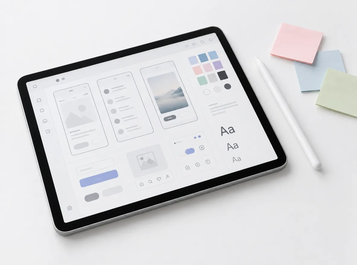
Product UX audits, onboarding and dashboard UI, Figma prototypes and a design system of tokens and React components, from one team that designs and builds, so nothing is lost between the design file and the release.
See how it works
FIG 02 · Quick answer
A SaaS design agency researches, designs and tests the product your customers log into: onboarding, dashboards, settings and billing. Elgrith runs UX audits, designs flows and UI in Figma, builds a design system of tokens and components, then codes it in React with the same team, so nothing is lost in handover.
FIG 03 · Why it matters
From Nielsen Norman Group’s Design Systems 101 (last reviewed 27 Aug 2026). We found no SaaS UX benchmark we could verify at a primary source, so this page doesn’t quote one.
01
At scale
NN/g defines a design system as “a complete set of standards intended to manage design at scale using reusable components and patterns.”
Source: Nielsen Norman Group, Design Systems 101(opens in a new tab)02
Faster
NN/g: “The primary benefit of design systems is their ability to replicate designs quickly.” New features start from tested components, not a blank canvas.
Source: Nielsen Norman Group, Design Systems 101(opens in a new tab)03
Activation
We set design goals in your product numbers, such as activation, time-to-value and trial-to-paid, measured in your analytics before and after release. We don’t promise percentages up front.
FIG 04 · Definitions
Three parts of one job. Most SaaS products need all three, in that order, at a depth that matches their stage.
| SaaS UX design | SaaS UI design | Design system | |
|---|---|---|---|
| What it covers | Flows, information architecture, onboarding and how users reach value | Layout, type, colour, components and every state of every screen | Tokens, components, patterns, docs and the rules for changing them |
| Main deliverables | Audit, research findings, user flows, wireframes | High-fidelity Figma screens and clickable prototypes | A Figma library, coded React components and Storybook docs |
| Answers the question | Can people get their job done? | Is it clear, consistent and on brand? | Can the team build the next screen fast and the same way? |
| When you need it | Before and during any redesign or new feature | Whenever screens are designed | Once two or more people design or build the product |
FIG 05 · What you get
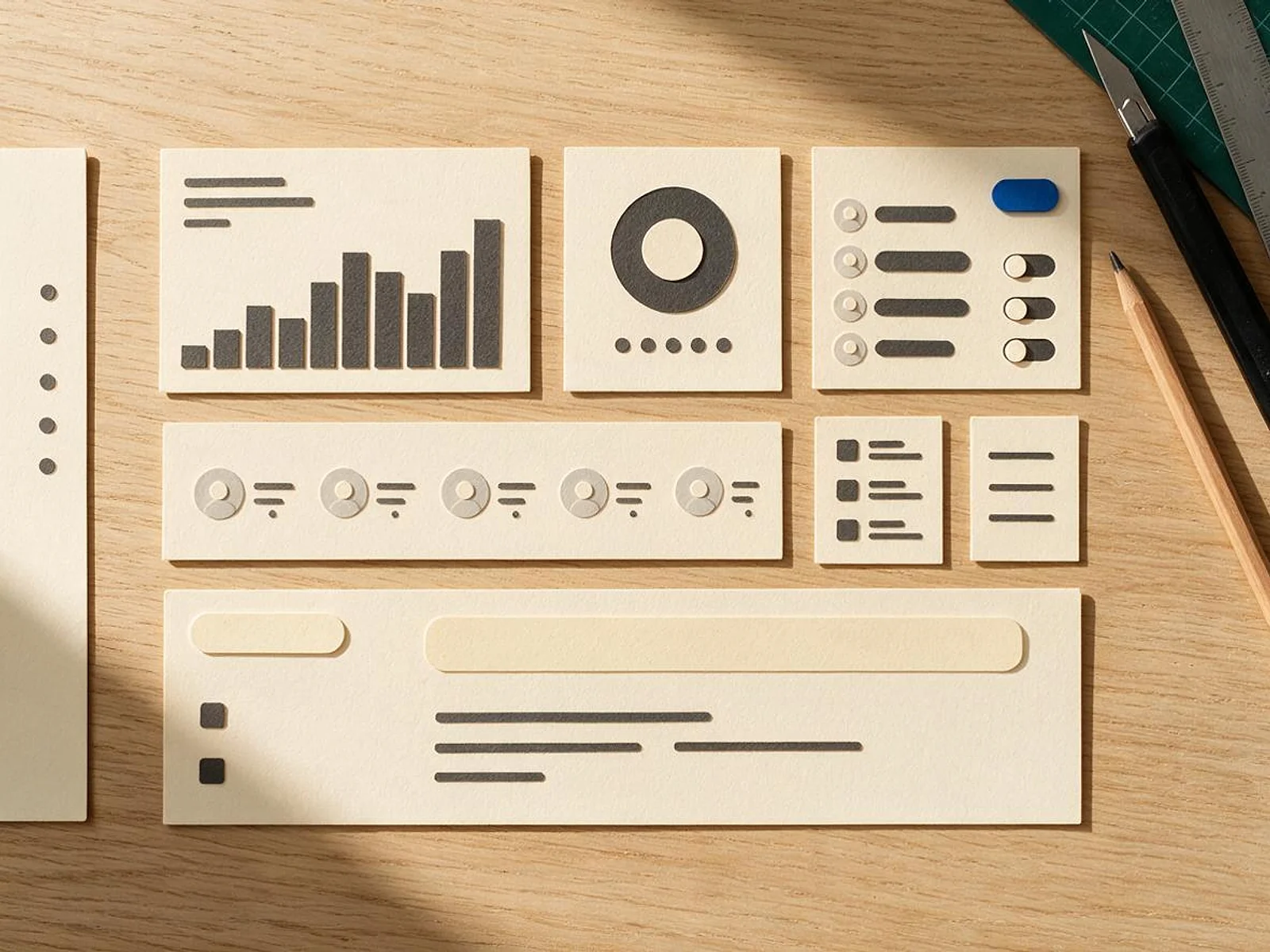
From the first audit to components in your repository. We design the product your customers log into, not only the marketing site around it.
01
02
03
04
05
06
07
08
Deliverables
12
FIG 06 · Screens we design
Every screen draws on the same design system, so a fix in one component shows up everywhere it is used.
FIG 07 · Flagship build
Kenerate AI is our flagship build: an all-in-one AI image and video studio, designed and engineered by Elgrith. It puts a lot of product behind one interface.
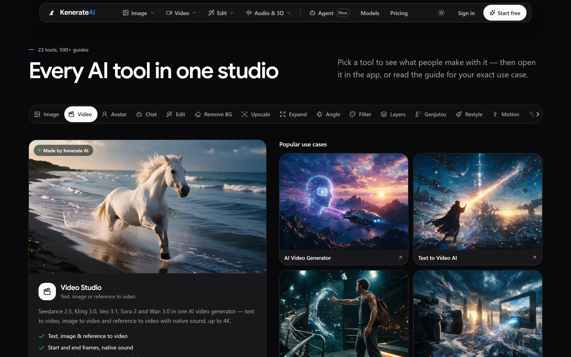
Tools: 23+ studios with guides for every use caseDesigned and engineered by Elgrith
FIG 08 · Design systems
Our design system services cover what NN/g describes: standards, reusable components and patterns. We deliver them twice, as a Figma library and as coded components, and keep the two in sync. That is the gap most design system agencies leave.
06principles
Colour, type, spacing, radius and motion as Figma variables, exported as tokens your code reads, so a brand change is one edit.
React and Tailwind CSS components on accessible primitives such as Radix, with every state designed and built.
Storybook pages with usage guidance, do and don’t examples and live props, for designers and engineers alike.
Who owns the system, how new components are proposed and reviewed, and when a one-off becomes a pattern.
Releases with a changelog and a deprecation path, so product teams upgrade on purpose, not by surprise.
Light and dark modes, and white-label themes for multi-tenant products, from the same tokens.
FIG 09 · Design + build
Most SaaS design agencies stop at the Figma file. Our designers and engineers work in the same sprints, so the design system ships as code and the product matches the design.
06principles
The team that designs your product can build it, from multi-tenant back end to billing.
SaaS developmentComponents built in React and Next.js straight from the Figma library, with tokens shared between them.
React developmentStarting from zero? We design and build a first version you can put in front of users.
MVP developmentData-heavy screens designed with the people who build the queries behind them.
Data visualizationPlan pages and upgrade flows wired to Stripe, PayPal or Razorpay by the same team.
Payment gateway integrationDesigners review every build on staging against the design before it ships.
FIG 10 · Accessibility
We design and build against WCAG 2.2 AA from the first wireframe, so contrast, focus and labels live in the components instead of being patched later. This is design practice, not legal advice or a compliance guarantee.
06principles
Every text and background token pair is checked for contrast before it enters the system.
Visible focus, logical tab order and focus traps in dialogs, designed and tested.
Labels, roles and live regions for async states such as saving, loading and AI responses.
Touch targets sized for fingers and motion that respects reduced-motion settings.
Charts that don’t rely on colour alone, with text alternatives and data tables.
Already shipped? We audit against WCAG 2.2 AA and guide the fixes.
Website accessibilityFIG 11 · Measurement
Goals are agreed with you and measured in your own analytics, against baselines taken in the UX audit.
| Metric | What it tells you | How we measure it |
|---|---|---|
| Activation | Whether new users reach their first real result | Product analytics events agreed with you |
| Time-to-value | How long that takes | Time from sign-up to the activation event |
| Trial-to-paid | Whether the product sells itself | Billing and analytics data |
| Task success | Whether people can do the job the screen is for | Usability tests before and after |
| Support tickets by feature | Where the UI confuses people | Your help desk, tagged by feature |
| Design system adoption | How much of the product uses shared components | Component usage in code and Figma |
We don’t quote benchmark uplift percentages we can’t source. Targets are set with you after the audit and reviewed at the check-ins in your written scope.
FIG 12 · Process · 7 steps
A fixed written quote after the audit, weekly demos, and a design system delivered in Figma and in code.
A review of your product, analytics and support tickets, with issues ranked by impact and effort. You get a written scope and a fixed quote.
Interviews, usability tests and data that show where users get stuck and what they came to do.
User flows, information architecture and wireframes for the journeys that matter most.
High-fidelity screens and clickable prototypes, tested with users and reviewed in weekly demos.
Tokens and components in Figma, then in code, documented in Storybook.
Design QA on every build, by designers who sit in the same sprints as the engineers.
The scorecard compared with the audit baselines after release, and the next priorities agreed.
FIG 13 · What you get
Written into your fixed quote, so you know exactly what you are paying for before work starts.
12items
FIG 14 · Tech & tools
Proven, well-supported tools, chosen for your project and set up in accounts your business owns.
FIG 15 · Who it’s for
The depth changes with your stage. The way we work doesn’t.
3 audiences
Early stage
Flows, UI and a lightweight component library, designed and built together, so your first release looks and works like one product.
Scaling SaaS
A full design system with governance and versioning, so several squads can ship features that look and behave the same.
UK teams
UK projects run through our London client partner, with design and engineering in New Delhi. We design to WCAG 2.2 AA and UK English from the start.
FIG 16 · Working with us from the USA and UK
Every project gets a point of contact in New York or London and an engineering team in New Delhi. Here is how today’s working days line up, live.
New York
North America
--:--ET
London
UK & Europe
--:--UK
Fixed-scope project
A written scope, one fixed price and a dated plan. Suits websites, apps and MVPs.
Dedicated team
Designers and engineers on your roadmap every month, billed monthly.
White label
For US and UK agencies: our work, your brand, unbranded deliverables.
Calls on ET or UK hours
FIG 17 · Decide
All three can work. The right answer depends on how much you need at once, and for how long.
| SaaS design agency | In-house designer | Freelancer | |
|---|---|---|---|
| Best for | A redesign, a design system or a new product, done properly once | Steady, everyday product design | One defined piece of work |
| Skills | Research, UX, UI, systems and engineering together | One person’s range | One person’s range |
| Design system in code | Yes, if the agency also builds | Needs engineering time | Rarely |
| Ramp-up | Fast, with a set process | Hiring takes time | Fast |
| Watch for | Agencies that stop at Figma | Spread too thin across the roadmap | Availability and handover |
FIG 18 · Checklist
Most SaaS UI/UX design agencies have strong portfolios. These questions show who can carry a product past the Figma file.
| Ask for | Why it matters | What good looks like |
|---|---|---|
| Product work, not only websites | Marketing sites and products are different jobs | Dashboards, onboarding and settings in the portfolio |
| A design system in code | Figma-only systems drift from the product | Tokens and components in your repository |
| Research in the plan | Opinions are not evidence | Interviews or usability tests before final UI |
| Accessibility from the start | Retrofitting costs more | WCAG 2.2 AA in the component specs |
| How they measure | Pretty screens don’t prove value | Metrics agreed up front, baselines from the audit |
| Ownership | You may change agency later | All Figma files and code in your accounts |
FIG 19 · Compare
| Design and code together | Figma handoff only | |
|---|---|---|
| What you receive | Figma library, coded components and docs | Figma files and a handoff meeting |
| Design drift | Low: the code is the system | Grows with every sprint |
| Engineering effort | Components arrive ready to use | Your team rebuilds each component |
| Design QA | Built into the same sprints | Often skipped |
| Best for | Products that will keep growing | Teams with strong front-end engineers and time |
FAQ
Straight answers about SaaS Design with Elgrith.
It depends on the number of flows and screens, whether research and usability testing are included, the scope of the design system (Figma only, or Figma and code), product complexity such as roles, multi-tenancy and data-heavy screens, and whether we also build it. We don’t publish prices: after a free call you get a written scope and a fixed quote.
Free 30-minute call
Tell us where users get stuck. After a free call you get a written scope, a UX audit plan and a fixed quote.
Pick a day. You'll choose a time in your own time zone on the next step.